Forecasting the Future of Color
by hanna_kowal | March 23, 2026 10:58 am
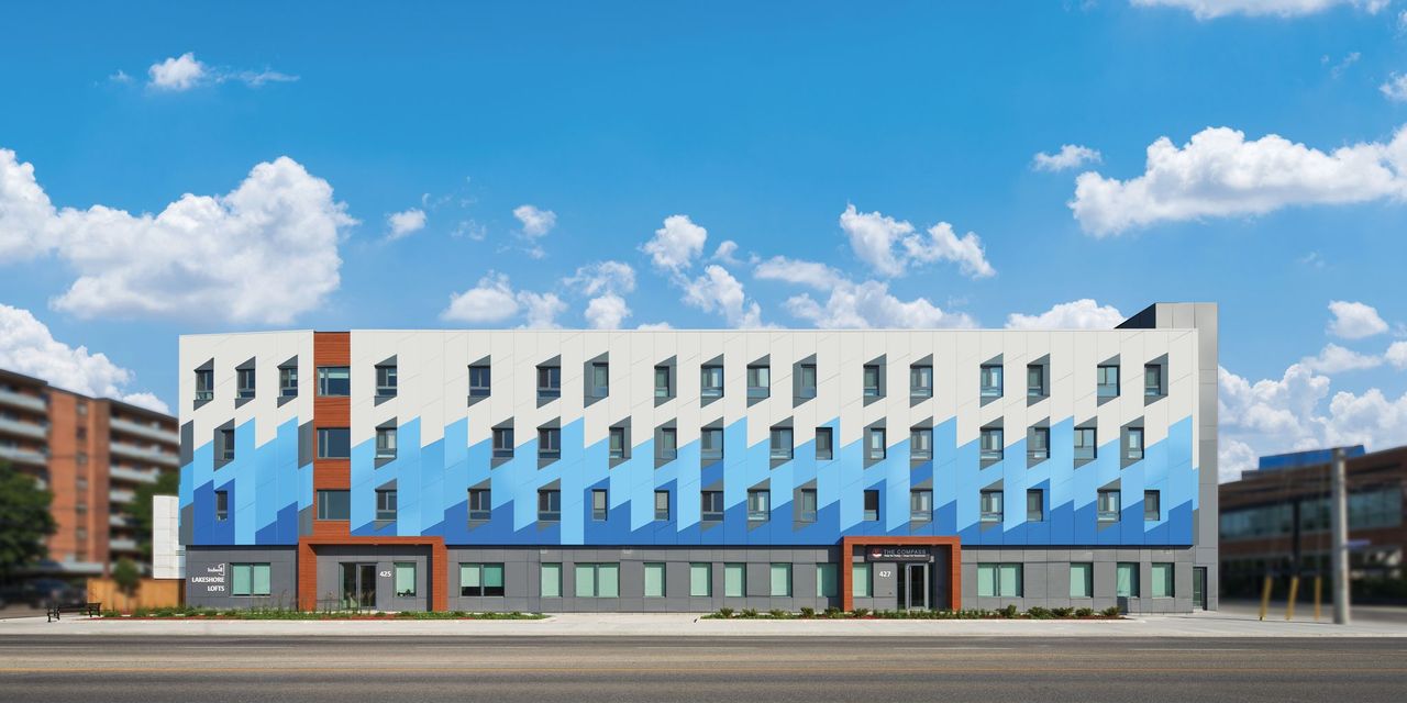 [1]
[1]Photo by Michael Muraz/courtesy ALPOLIC
In an industry where aesthetics and performance converge, color is more than a design choice—it is a strategic advantage. This article transforms global megatrends into actionable color and finish forecasts that shape the architectural environment for years to come.
From global concepts to architectural applications
Broad, global concepts—cultural, technological, and environmental shifts—influence how people live and interact with spaces. While megatrends in coatings and paints do not change overnight, their subtle evolutions reveal where innovation is headed. Tracking these shifts on a macro level offers insights into emerging behaviors and material preferences, which are then distilled into color stories that resonate with architects and specifiers.
Trend forecasting is cyclical and constantly moving. The role of color designers is to interpret these movements early, so that specifiers and architects can stay ahead of upcoming market shifts.
The science behind color behavior
Color forecasting is not just about aesthetics; it is rooted in consumer behavior. How people perceive color is influenced by their surroundings, lifestyle, and even the textures they encounter daily. This holistic approach enables predictions of what will feel relevant and desirable in the years to come.
Beyond perception, color plays a critical role in shaping experiences across different environments. In commercial spaces, color can serve as a powerful branding tool, guiding wayfinding and reinforcing performance-driven design. Eighty percent of the information assimilated through the senses is visual, and the first thing consumers see is color. Research has shown that consistent presentation of a brand increases revenue by 23 percent,[2] illustrating a significant correlation between tactful design and business value.
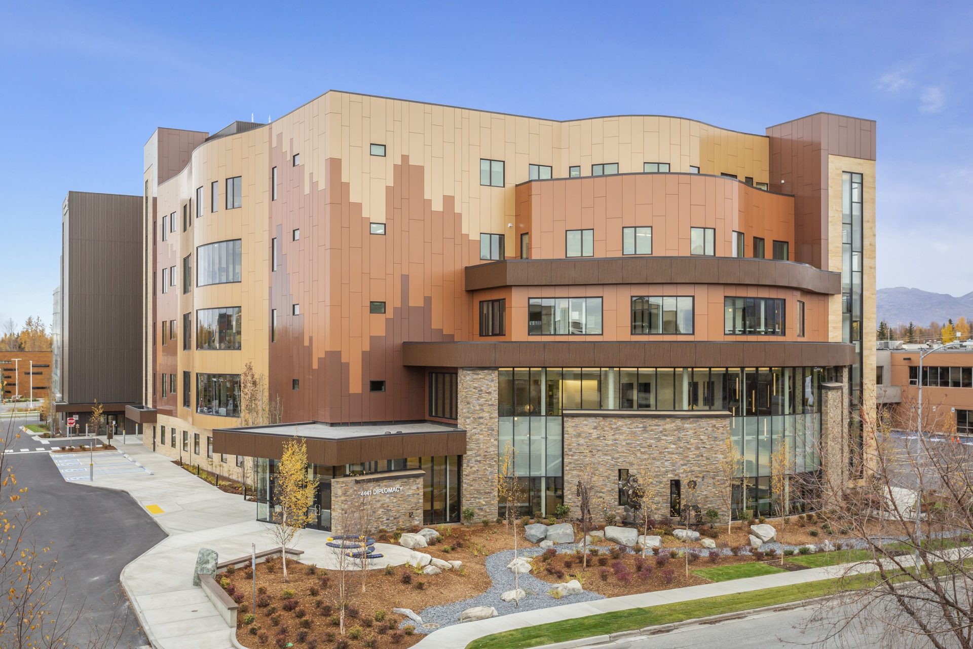 [3]
[3]Photo courtesy ALPOLIC
Residential applications lean toward self-expression, allowing homeowners to reflect their personality and regional preferences. Educational settings use color strategically to foster engagement and focus, while industrial environments prioritize durability and safety without sacrificing visual impact. As color is deeply emotional and often tied to cultural and regional identity, its application in coatings becomes a nuanced balance of function and feeling—making forecasting an essential part of creating spaces that resonate with people’s lives as they evolve.
For example, finish trends have shifted dramatically. High-shine, high-sparkle coatings once dominated, but today’s preferences lean toward satin and mica finishes that mimic natural elements. This evolution reflects a growing desire for authenticity and tactile experiences—textures that evoke nature and invite interaction. Designers and specifiers increasingly look to natural materials for inspiration, drawing from stones, gems, and mineral surfaces to create finishes that feel organic yet distinctive. Satin and mica coatings offer subtle shimmer and depth, echoing the complexity of granite or the iridescence of quartz, while maintaining durability and performance.
This shift away from glossy, reflective surfaces stems from changing consumer priorities: high-shine finishes often feel artificial and less aligned with the biophilic design movement, which emphasizes connection to nature. Today, coatings are not just about color—they integrate texture and tone to either complement or contrast their surroundings. A building in a dense metropolitan area might use a deep, matte black to stand out among silver facades. At the same time, another project could choose earthy mica tones to harmonize with its natural surroundings. These nuanced changes allow architects to craft environments that either blend in seamlessly or make a bold statement, reinforcing the role of finish as a critical design element.
 [4]
[4]Fluoroethylene vinyl ether (FEVE)-based finishes “have the largest range of colors and gloss in the industry. It can make both bold and bright statements or sophisticated and earthy tones,” explains Renee Mullins, senior marketing manager for ALPOLIC.
Mullins knows firsthand how even small changes in hue can alter an intended visual story.
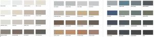
On the necessity of hundreds of shades of white in a selection, Mullins expresses the importance of variety: “Are you looking for something clinical or comforting? Color tells that story.”
With a dozen stocked shades of white alone, most designers and architects can find a suitable match that meets their required lead time and budget. Major manufacturers in the paints and coatings industry enable the creation of a wide variety of custom colors on demand, providing designers and architects with unparalleled creative freedom. This versatility empowers specifiers to push boundaries and tailor finishes to any vision, showcasing capability and flexibility in an era where individuality and contextual design matter more than ever.
Why forecasting matters
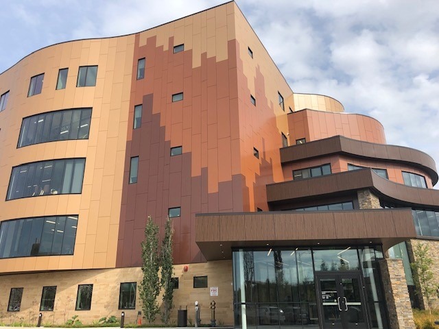
 [5]
[5]Photo courtesy ALPOLIC
Looking three to five years ahead gives manufacturers, architects, and specifiers a competitive edge. By aligning product development with future trends, they can meet market demands before they peak. This foresight ensures that projects remain relevant and compelling long after they are completed.
At its core, trend foresight is about creating spaces that feel timeless yet forward-thinking. When it comes to metal coatings, timelessness is critical—not only to prevent designs from feeling dated but also to ensure adaptability for multi-use spaces and evolving architectural needs. Coatings must deliver durability while satisfying aesthetic expectations, standing the test of time both physically and visually. For this reason, specifiers rely on experts in color and finish forecasting, allowing architects to focus on their craft with confidence that the coatings they choose will maintain relevance and performance for decades.
Durability
Color innovation is only part of the story. Ensuring that color lasts, through sun, rain, heat, and time, is what transforms inspiration into impact. To support longevity and durability, coatings must undergo extensive testing in both real-world environments and accelerated laboratory conditions. These tests help confirm that the colors selected in the present will remain true and vibrant for years to come, even in the harshest climates.
Architectural coatings must withstand the demands of fabrication, installation, and long-term exposure. Durability is not only about resisting wear, but also about preserving beauty and maintaining its aesthetic appeal. For product longevity, it is essential to specify paints and coatings designed to protect against fading, chalking, and cracking, so the color stays consistent across every panel, every angle, and every project.
This commitment to performance gives architects and builders confidence that their design vision will endure, both visually and structurally.
By blending research and creativity, global trends, material innovations, and consumer insights, architects and designers can create color narratives that shape the possibilities of architectural design. The result is coatings that protect metal surfaces and elevate them into bold, expressive design statements.
Brynn Wildenauer is a senior architectural color designer at Sherwin-Williams Coil Coatings, where she specializes in color, material, and finish (CMF) development. With a strong foundation in industrial, product, and architectural design, she brings a keen eye and a solution-driven mindset to every project. Wildenauer’s passion for innovation and fascination with the dynamic world of color fuel her work, from trend research to transforming spaces. Collaborating closely with cross-functional teams, she ensures seamless execution and intentional design that elevates the built environment.
- [Image]: https://www.metalarchitecture.com/wp-content/uploads/2026/03/Lakeshore-Lofts.jpeg
- Research has shown that consistent presentation of a brand increases revenue by 23 percent,: https://sensationalcolor.com/
- [Image]: https://www.metalarchitecture.com/wp-content/uploads/2026/03/Alaska-Native-Medical-Center-1.jpg
- [Image]: https://www.metalarchitecture.com/wp-content/uploads/2026/03/NA-Medical-Photo-5.jpg
- [Image]: https://www.metalarchitecture.com/wp-content/uploads/2026/03/SW_ALPOLIC-Neutrals-Collection.jpg
Source URL: https://www.metalarchitecture.com/articles/features/forecasting-the-future-of-color/