PHOTOS COURTESY SHERWIN-WILLIAMS COIL AND EXTRUSION COATINGS
Selecting the right color for a building project or product can be a daunting task as color has a profound effect on the human experience. In fact, science shows that color impacts emotions toward any environment, whether it is the places people reside, work, or play. It also holds a dramatic role in changing and improving the aesthetic appeal of these areas.
So, if it has been proven that color can be a powerful key feature for building components, why are yesterday’s whites, beiges, and grays still the leading choices today for architects and designers? Developers want to ensure their buildings do not appear dated years down the road, so color choices tend to be more conservative. Yet, there are definitive color trends as the design industry increasingly desires ways to express creativity. This is accomplished by re-evaluating the power of color, turning to forward-looking color trends to bring bolder color and finishings options to the table.
The breadth of color and tone options for coil and extrusion coatings alone have expanded in recent years. While the historically common metallic finishes continue to trend in popularity, the industry is witnessing an interesting shift toward warmer tones, like coppers and bronzes, in both architectural and interior design markets. Colors that have dominated neutral spaces—such as deep navy, subtle gray, dark black and stark white hues—are also gradually lightening and shifting warmer.
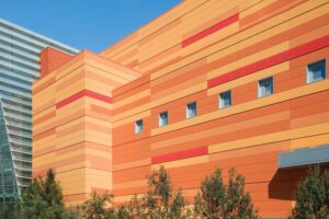
Impressions and profits
For far too long, color has been viewed as the “fluff” to a project. It is time to shift that thinking and make color an integral design component, one based on input and advice from color experts who, using the latest trend research, can recommend the best options linked to a project’s purpose, region, and desired community impact. Something as simple as the shift from cool to warmer metallic tones might seem like a low-impact decision. This single shift can make all the difference in how people respond to the final product and how its impression will stand the test of time, ultimately affecting a business’s potential profitability.
As color and finishing options for metal architectural projects are broader than ever before and selecting the wrong color can mean failure, there are some key considerations related to a project’s goals and needs that can help make the process easier.
Color can compliment or contrast
Color can be contextual to its surroundings or at odds with its environment. When determining the design direction, color can enhance or distract, compliment or contrast.
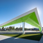
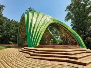
Compliment: color combinations that exist in harmony and are pleasing to the eye allow a project to naturally blend in with the surrounding environment, creating a sense of belonging.
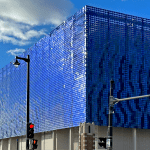
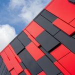
Contrast: color combinations which are strikingly different create visual discord that evokes a sense of difference, causing a project to purposefully stand out in its environment.
Color by region
Knowing the market is key because color psychology is not universal and each culture around the world has its own symbolic meaning of color. Advertising and architecture have a long history of using color in media campaigns, branding, and the built environment to induce predicted behaviors and outcomes, but when there is not a strong understanding of the region, perception and outcomes can drastically shift.
It is all in the effect
Special effects can make all the difference in distinguishing a project’s appearance and can make a major impact. They provide a unique aesthetic when wanting additional visual interest such as brightness through highlights, or a color shift when viewed from different angles. These proprietary blends of pigments can render movement through a slight color change or intensity of light through the level of shimmer or sparkle.
Textured effects: offer a raised appearance to redirect light for enhanced visual depth, with shading to mirror the eye’s natural horizontal motion.
Shimmering effects: create a reflective and sparkling effect that make building’s exterior “pop.”
Pearlescent effects: appear to shift in color when viewed from different angles or sunlight, much like a chameleon.
No project is the same, and while color may have been yesterday’s afterthought, there must be intentionality to ensure a building evokes the right emotions and stands the tests of time. Color is just that powerful.
Kiki Redhead is global CMF and trend manager for the Sherwin-Williams DesignHouse and Brynn Wildenauer is architectural color designer for DesignHouse.


