For facades and interiors alike, coil, liquid spray, and powder coatings offer designers more ways to temper metal’s traditionally cold aesthetic.
Facades create a building’s first visual impression, communicating function, identity, and intent before visitors enter. Interior walls shape the atmosphere occupants experience over time and can support wayfinding, artistic expression, or act as a blank backdrop. Designing both requires balancing immediate impact with long-term comfort and usability.
The color of facades can also influence the success of a design’s integration with its surroundings.
To illustrate these principles, Kiki Redhead, global color, material, finish, and trend manager for Sherwin-Williams DesignHouse, points to several projects where Sherwin-Williams coatings were used to help achieve the desired architectural expression.
“Walls can be quite jarring, especially if they are popping out of a neighborhood and not incorporating the architectural exterior with the landscape and the other buildings around it,” Redhead says.
Designing with light in mind
When discussing light and metal walls, Redhead highlights the importance of considering the following factors: light quantity, absorption, reflection, time of day and seasonal changes, and the type of light, whether natural or artificial. These conditions affect perceived color, contrast, glare, and surface depth, so they should be evaluated before finalizing a color and finish. Redhead mentions evaluating the tints, tones, or shades that “enhance the space and partner with the lighting rather than fight with the lighting.”
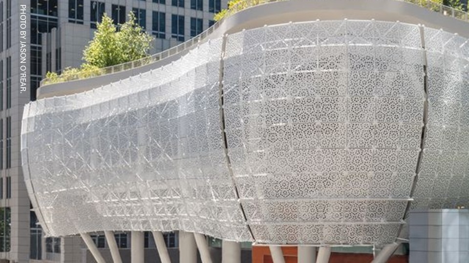
In the San Francisco Bay Area, at Salesforce Transit Center, light is an active part of the facade. Designed by Pelli Clarke & Partners, the curved awning of 140,000 sf (13,006.4 m2) of perforated aluminum panels is finished in a pearlescent white coating containing small metallic flakes. Those flakes reflect daylight, creating a shifting sparkle and visual depth, while the perforations admit diffused light into the interior. Together, the finish, perforation pattern, and curved geometry create a dynamic appearance across the large metal surface.
A monochromatic palette with subtle lighter, darker, warmer, or cooler variations can reduce visual harshness. Another strategy is to introduce micas, metallics, and textures that alter how light is reflected, refracted, or absorbed at the surface. Redhead explains the “additional sensorial experience that those types of finishes and effects give can also manipulate the appearance of the big wall surfaces with the lighting available in the space.”
Purposeful expressions of place
When specifying the right material and finish for a metal wall, the selection should account for the building’s occupants, function, and setting. A useful question is: how will this wall look, perform, and feel to the people who encounter it?
Understanding the general emotional response people may have to a building’s design comes down to meaningfully reflecting on the needs of the communities using the space. Architects can use this thought process to develop material palettes that respond to the needs, activities, and expectations of key user groups. Redhead explains this analysis as a key part of the process: “As the designer is working on creating the scheme and the mood for the design, they use those tactics to identify and specify the colors that will create that same emotional experience and reaction from broad groups of people.”
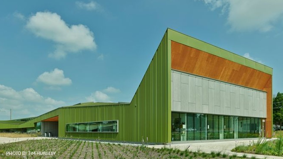
At Thaden School in Bentonville, Ark., the green-gold metallic facade is a purposeful representation of the context and community behind the design. The custom color draws from the surrounding prairie grasses while also referencing the region’s automotive culture and the aviation legacy of the school’s namesake, Louise Thaden. Across the buildings’ folded, ribbed surfaces, the finish shifts with daylight, tying color, form, and local identity into one cohesive architectural statement.
In smaller spaces, the more specific the needs of the occupants, the more walls can “talk” to the individuals within the community. For example, a classroom might use printed graphics as an age-appropriate visual cue, while a lecture hall may use a low-gloss, single-color finish where glare control is a priority.
Airports, shopping centers, and convention centers can host tens of thousands of people a day, depending on the situation. In these large, high-traffic spaces, designers can successfully match metal walls to occupants’ needs, either by embracing the versatility of neutrals or by integrating location-specific motifs to introduce the local culture.
Why walls are warming up
The baseline for wall color design has shifted. Neutrals are a versatile design option that architects and specifiers often veer toward when creating designs that integrate seamlessly with their environments. For some time, true neutrals—blacks, whites, and grays—were at the heart of this baseline. Redhead explains that these colors gained traction around 2006, with the automotive and appliance industries leading the charge through stainless steel and silver.
Architecturally, the stark neutrals first emerged in luxury residential with contrasting blacks and whites across walls, trim, and details. Following the 2008 market crash, Redhead observed the architectural landscape fixated on the grayscale for nearly two decades.
Today, these colors are softening. There has been an increasingly visible shift toward complex neutrals, which Redhead defines as “neutrals that are found more in nature: beiges, the taupes, the tans, browns, some greens, some blues.” She connects the growing interest in warmer, nature-associated palettes to a broader desire for more comforting spaces, a preference that gained visibility during and after the pandemic.
Architects, designers, homeowners, and occupants alike needed the walls they spent so much time inside to be a source of comfort. Where the harshness of true neutrals can come across as jarring, Redhead says, “People are looking for spaces that are more connected with nature and that have a more nurturing aesthetic.”
Influencing perception
Perception of a wall is shaped by color, finish, texture, gloss, pattern, and the light conditions in which it is viewed. In terms of color psychology, Redhead shares, “the emotional side of our brains that creates a sense of calm or excitement, or that sets a specific mood within the space, is reflected back to the person having the experience with that space.”
Essentially, how any visual design element resonates with an individual is personal and highly dependent on the unique experiences and connections a person has with specific textures or colors. At the same time, there are design elements that may appeal to a broader social group through shared experiences, whether geographical, cultural, or otherwise. Understanding the styles, textures, and colors that appeal to these demographics is vital. This approach expands metal’s expressive range beyond its familiar industrial associations and into the comfort and versatility that the material can provide today.
Variety in metal wall expression
Redhead mentions tactility in walls as a trend for both interiors and facades. She explains a reach toward materials like “fuzzy fabric, or some sort of coating that might have a visual or an actual sensorial experience to touch.” Sand and wrinkle finishes can introduce physical texture, while veining effects can create visual texture. Both can soften the perceived character of a metal wall.
Coatings can give one metal substrate the visual character of other metals, stone, or weathered surfaces. Finishes that evoke iron, aluminum, stone, or aged metal can lend a more substantial or weathered character. Redhead also presents the option of “aged patinas for a copper look that mimics a metal and a process of oxidation that happens naturally with metal to create looks like that both on exterior and interior.” Using finishes that mimic a metal’s distinctive traits on other metals expands opportunities for clean applications of the material’s unique qualities in more versatile situations.
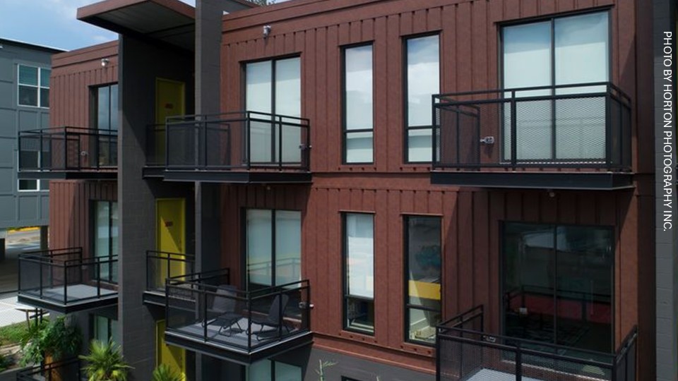
At Freight Yard in Tallahassee, Fla., a printed coating creates the visual texture of weathered steel without relying on naturally oxidized metal. The design goal was to emulate the look of shipping containers on the exterior. Applied in multiple layers with a dark base coat, a lighter-brown printed pattern, and a protective clear coat, the finish evokes the irregular depth and patina of aged shipping containers while providing a more controlled, consistent appearance. The project shows how coatings can use visual texture to give metal a sense of history and material character, drawing on the context of the location’s industrial setting at the Railroad Square arts district.
Modern coating, painting, and printing technologies have made metal one of the most adaptable materials for walls. With micas and metallics, walls can further embrace or pay homage to the natural material’s visual qualities. Through varying gloss levels, they can adapt to different expressions and reflections of light.
By varying shades with multi-tone coatings, an illusion of texture can be created. With tactile coatings, an authentic warmth can be introduced to the material. Balancing these considerations with color can create metal walls with deliberate and impactful resonance for both building occupants and passersby.